If you're like most photographers, you will soon be overcome with the desire to display your work once you've begun to master some of the more critical camera, composition and enhancement fundamentals. We started with Web graphics as it is a more forgiving medium than producing prints. In the past, there were a host of technical issues with print production that needed to be resolved in order to successfully reproduce what you actually see on the screen. Today, however, modern printers converse with software designed especially to integrate your on screen image details with targeted inks and specialty papers that make reproduction a breeze. As we also found glossy finishes were not to our liking, you may find our venture into medium-format watercolor paper something new and satisfying for displaying images in larger print format than simple card stock.
In our former website we produced our Galleries using the HTML file creator provided in BreezeBrowser Pro. If this sounds like a daunting task, don't be intimidated as the process is automated and simple to implement. We populate a folder with post-processed TIFF images that are reduced to a size of 6X4 inches. We then Edit>Select All, activate the gallery production program in Tools>HTML, enter a suitable heading description and choose the multi-index picture frame option that translates the images into a high quality JPEG template that produces a Main Image (1100X900 pixels) and Thumbnails (420X420 pixels). We then transfer the finished folder to our host site using the CuteFTP Home Edition. We follow the same process today but utilize an internal program to translate these files to our current display format.
When it comes to Web graphics, tonal correction, color adjustment and sharpening doesn't have to be an arduous process. It's a much more forgiving medium than print. We use a simple and quick workflow that generally produces good results. However, mastering the subtlety of each enhancement tool is definitely an acquired skill. As you become more familiar with the power of PhotoShop and compare your results with the work of others, your eye will soon begin to differentiate between what is good or bad color and clarity. Notwithstanding, there are a relatively small number of simple procedures you can try early on that will jump start your ability to determine what, if anything, can be done to enhance an image. Most beginners are lulled into over-using PhotoShop on both good and bad exposures. From our perspective, if you begin with a well-exposed image, there is generally no need to perform other than a few simple functions to bring out the best for use as a Web graphic.
Although we've already outlined a seven step enhancement process to get you underway (see our Processing synopsis), the following is a variation that we often use when exacting standards are not called for. Remember, you don't have to implement every step if the image is good and little enhancement is required. Before getting underway, make sure you have set up Curves and the Eye Drop Tool correctly (refer to our Workflow synopsis. This will ensure that you maximize the results for color cast correction and pixel sampling. Although we process our images at 16-bit, 360 pixels /inch, we can assure you that working in 8-bit and 240 pixels per inch produces no real differences in color and clarity perception. In any event, the result will be reduced to JPEG at 72 pixels/inch for use as a Web graphic (definitely not a good resolution to be enhancing images at). We also recommend that you do all color adjustments and sharpening at 50% image magnification on a flat screen monitor in a relatively dark room or one where all artificial light has been minimized. It's also best to place the image on a neutral grey background.
In Adobe Camera RAW, we set the white and black points first by moving the Exposure and Black sliders until the image is "pleasing" to the eye. We define pleasing as revealing as much sharp detail as possible without creating or retaining any clipping extremes (we correct any minor clipping that remains with the Highlights slider). This is an easy process as depressing the ALT key while moving the sliders reveals exactly where clipping occurs. If any local contrast enhancement is required, we adjust the Clarity slider until we feel the image looks crisp. We then Open The Image in PhotoShop. This completes the RAW conversion process.
If the image still exhibits a soft or bland look, we will often try Image>Ajustments>Curves>Auto to see if this creates sufficient contrast to better define the subject. Surprisingly, this generally produces a very pleasing combination of contrast and color saturation requiring no further enhancement. If not, try clicking the grey Eye Dropper in a suitably neutral area of the image, keying on obvious greys if they are present. If detail remains hidden, we might try the Shadow/Highlight tool in the same Menu to see whether improvements can be made without creating any noise artifacts (a condition that produces noticeable grain dots throughout the image). Remember, each operation in this process is inherently destructive as you are working on the background layer affecting all image pixels. As such, it is imperative to keep the number of operations executed to an absolute minimum. Try starting with Shadows (25, 50, 30), Highlights (0, 50, 0) and Adjustments (0, 20), then micro adjust each slider to suit. The objective is to maximise the amount of detail captured without degrading image quality. Usually the above is sufficient but if the image still lacks "punch" we will apply Saturation, Hue, Lightness, Contrast and Brightness (in that order) until we get a result we are happy with.
Before sharpening, we will classify an image as sharp, soft or slightly out of focus. This determines whether we use Unsharpen Mask or Smart Sharpen and what settings we intend to use with each. Because sharpening is a curse and inherently produces noise artifacts and halos, we use a process that separates detail from color that eliminates both effects. Under Windows we choose Channels to separate color into its RGB components. Next we select Lab Color under Image>Mode and click on Lightness in the New Layer pop-up menu. This reveals the image detail without the color component. Although we avoid the use of "pre-sets," a trick at this stage is to experiment with the sliders in two programs: Topaz Labs Clean (Crisp Module) and DeNoise 5.1 (in that order). You'd be surprised at how these plug-ins can improve the clarity of an image.
Sharpening the detail now depends on our image classification. For sharp or soft images we use Unsharpen Mask. For soft images, we set Amount (A), Radius (R) and Threshold (T) to 150, 1 and 10 respectively. Sharp images use a more all purpose setting of A (85-120), R (0.5) and T (4-3). For images that are slightly out of focus we use Smart Sharpen with Remove Gaussian Blur and More Accurate highlighted. Here we set A to 65 and R to 1 and generally apply twice. Simply select the Lab tab to check results and return the image to RGB color under Image>Mode when you are happy with the result. Remember, it's an iterative process that requires a fair amount of experimentation to judge how best to interpret results.
As a final step, slight adjustment of the Black slider of the White, Neutral and Black component under Image>Adjustments>Selective Color can be quite effective in producing a much sharper image. Although some experimenting is necessary, you should find the above approach and settings produce good Web graphic results.
As we moved on and began to experiment with print production, we found the process to be laced with technical difficulties, especially color management and the need to calibrate a monitor to ensure WYSIWYG. It got worse as applications like PhotoShop needed to be augmented with printer profiles for such things as paper type and size. Rather than reproduce what is a well documented solution to these problems, our advice is to simply review the relevant sections in Scott Kelby's "Adobe Photoshop CS5 Book for Digital Photographers" that deal with how to configure your computer, monitor and printer to ensure excellent print production results. We have utilized his recommendations and found them to be exactly what the doctor ordered!
If your objective is to produce fine art prints cost effectively, look no farther than inkjet technology. Digital photography has spawned a host of high- quality, low cost printers that now exceed even the most demanding expectations. Medium-format inkjet printers, specialty papers and compatible inks now dominate the market, providing the beginner with output choices undreamed of in the heady days of film negatives and standard gloss or matte photographic papers. Today, inkjet printers are in widespread use. Most are capable of producing a vibrant color gamut with fine tonal variations. Epson led the charge with their UltraChrome K3 ink set and Super B 13X19 inch paper processing, providing consumers with the in-home ability to expand their creative talents beyond producing simple 6X4 inch prints. Successfully producing high-quality or fine art prints is a matter of rigorously structuring workflow and experimenting with various paper types and sizes to create a “look and feel” appropriate to the image you are processing. What works for a color landscape may be totally ineffective for a black and white portrait. Your taste and creative eye will dictate whatever medium matches your comfort zone. The objective is to produce a pleasing result, for yourself and others.
When deciding on an output medium, you must assess the various paper types and thickness (from rough absorptive to smooth-coated) and inks (from dye to pigment based) that are now available, including their permanence (tolerance to light, temperature and air quality). Print size is a matter of viewing distance. Here you simply want to ensure that detail at the level of an individual pixel cannot be seen and any printer errors such as banding (visible streaks through the print) have been eliminated. Whatever the ink base formula used, they all now produce roughly the same color gamut. Longevity is another matter. Here the standards or “display permanence ratings” as set by Wilhelm Imaging Research tips the scales in favour of Epson who offer ink and paper combinations that won’t degrade for almost one hundred years. Epson also uses a pigment based ink that provides a much wider range of paper choices than the dye based formulas used by, say, HP, at least in the recent past. You will also find that some printers target gloss and matte reproduction only while others, such as the Epson Stylus Photo R2400 that we use, can handle a broad spectrum of papers including rolls suitable for panorama printing. Taken as a whole, pigment based inks have a greater longevity and are best suited to matte or semi-rough surfaces while dye based formulas reproduce better on gloss or high lustre papers. Pigment based inks overcome their shortfall by employing a gloss optimizer in cartridge form. All this will undoubtedly change in the coming years as more and better inks are formulated. We're still firmly lodged in the past and have yet to update our printer to modern technology. Specialty papers almost always comprise a dual stratum (a substrate or base with a sizing overlay to ensure that ink will absorb and dry properly). In the past, early adopters of high quality and fine art print techniques would agonize over ink and paper ingredients in an attempt to develop quality output that defied early degradation. Today, beginners have the luxury of choice from papers and inks that have been extensively tested, usually targeting specific printers, assuring a predictable outcome that maximizes the printer’s capability. In fact, print drivers are now designed to match specific papers, a topic that is covered more extensively in our Workflow synopsis under the importance of color management. Besides the above, which all affect the cost of producing the type of print you actually want, having the ability to clean or easily exchange print heads is worth consideration as sending such key components for external repair is a costly venture.
It is important to recognize that all inkjet printers have a native print resolution. It now gets a bit confusing as printer drivers change pixels into raster cells which are composed of minute ink droplets or dots arranged in a matrix array that reproduces the color gamut and contrast of the pixels that comprise the original image file. Inkjet printers best suited for desktop use employ a drop-on-demand technique using either thermal (HP and Canon, often called bubble-jet) or piezoelectric (Epson) technology. Print resolution is measured in dots/inch (dpi) and expressed in terms of the horizontal and vertical movement of the print heads (for example, 4800 X 2400 dpi). To improve color gamut, manufacturers now use more inks (Epson uses eight in our Stylus Photo R2400, including three shades of black that help produce much finer tonal variations). A maximum horizontal print resolution of 2400 dpi is more than adequate to produce an excellent fine art print (a higher resolution simply uses more ink at a slower printing speed with little perceptual change to the final result). As such, it’s best to set your working space at the native resolution of the printer at the image RAW conversion stage in order to get the optimum results from your printer and to also finalize its size (if you scale later in Photoshop, size-up using “Bicubic Smoother” and size-down using “Bicubic Sharper”). The scaling algorithms are set in the General Preferences dialog box under Image Interpolation. You must ensure the paper you use is capable of absorbing the ink designated by whatever print resolution you have chosen. Fortunately this is relatively easy as most specialty papers are designed to work with specific printers and thus are compatible with the ink set the manufacturer employs. In summary, and roughly translated, a RAW seven megapixel image file converted and processed at 360 ppi is more than sufficient to produce an 11X17 inch fine art print on a 13X19 inch print medium. This means you don’t need large image files to produce relatively decent sized print output. If you want anything larger, it’s probably more cost effective to use an outside print agency.
Before actually producing a print, we recommend soft-proofing the image on your monitor. In Photoshop, setup using View>Proof Setup>Custom (utilize your specific printer profile and preferred Rendering Intent with Black Point Compensation and Simulate Paper Color checked and Preserve RGB Numbers unchecked) and activate using View>Proof Colors. It is also a good idea to activate and experiment with Gamut Warning to actually determine which colors cannot be reproduced accurately and are being automatically remapped. These are usually highly saturated tones that you may want to revise in the original image. If your prints are consistently too dark, it’s likely your monitor brightness is too high and should be decreased and the monitor recalibrated and a new profile created. Remember, the ability of any device including paper to reproduce a wide color gamut has its limits and can be a frustrating process to experiment with. Our advice is to stick with well documented “canned” solutions to begin and work backwards from the final print to try and resolve just what is causing the color reproduction issue that is bothersome to your eye.
The workflow we described earlier is designed primarily for Web graphics. Although prints require a more demanding approach, the sequence is the same. Achieve good tonal variations first then deal with color. We attack each on a global basis initially, working toward selective targeting of either a specific contributing component or an actual area of the image. To produce a pleasing result, it’s essential to develop an understanding of the capabilities of the basic tool set, especially those used to correct tones: Levels, Curves, Shadows, Highlights and separation of the Lightness component of an image using Lab Color. Learning when and where to manipulate each is the key to producing a good print. Color correction, on the other hand, is an endless process with many tools and really depends on your eye and the effect you are trying to create. As we point out later, extreme color saturation is a curse all beginners must learn to overcome.
First, let’s deal with tonal corrections. Before getting underway, it is important to recognize that a print medium comprising printer, ink and paper cannot reproduce the high contrast and saturated colors displayed on a monitor. Fortunately, color is a relatively easy issue to address given the soft-proofing and gamut warning tools at your disposal. Reproducing subtle variations in tone is another matter. It’s axiomatic, to produce a good quality print, the devil is definitely in the detail! Here you must rely on Levels and Curves (the former is a conceptually simple tool with a limited capacity while the latter is complex to manipulate but produces tremendous results if mastered). To us, the key to producing a good print is to strike a balance across the breadth of contrast such that shadows, midtones and highlights have a smooth yet definitive appearance. The approach most photographers use is to first adjust globally then key on target areas using Adjustment Layers. As Curves is the preferred tool, understanding its underlying logic is critical. Fortunately the conceptual design is quite easy to visualize. The four by four graphic array comprising sixteen quadrants is bounded by black (lower left) and white (upper right). The four vertical columns from left to right are roughly equivalent to shadows (column one), midtones (columns two and three) and highlights (column four). Your task is to manipulate the curve in each zone (left click and drag), creating a good midtone contrast while balancing the extremes of black and white such that you don’t over-compress the highlights or block shadows. The intent is to retain as much of the images dynamic range as possible, creating a smooth appearance with an overall contrast that can be translated to paper.
One final word on targeting specific dark or light areas of an image - we now rarely use Layer Masks or Dodge and Burn techniques as plug-ins such as Viveza from Nik Software provide a simple to use masking tool that is quite effective in dealing with what were once tedious and time consuming tasks. We would urge beginners to try this route before attempting to learn the more complex side of Photoshop.
Although we slagged Levels earlier on, it does serve a useful, if limited purpose. We generally try it as a “first blush” for global contrast corrections using an Adjustment Layer. It’s a quick and simple tool but completely inappropriate for creating any tonal subtleties. For this you must rely on Curves. Again, its architecture is easy to visualize. The input sliders address, from left to right, Black Point, Brightness and White Point. Like Curves, they only operate on pixels of similar values. As such, small variances with either tool can often produce harsh results. To be frank, we frequently get tremendous results by simply applying Auto Curves for contrast followed by the Shadow/Highlight tool to reveal any hidden detail in the darker and lighter areas. Alternatively, we have found that switching the working space to Lab Color (Image>Mode>Lab Color) and manipulating the Lightness Channel with Curves, Brightness and Contrast, or both followed with a light Smart Sharpen is also an approach that gets the job done, especially with soft or slightly out-of-focus images taken at a high ISO. If you try this, remember to switch back to RGB Color prior to saving the image file.
There are also some tasks best done in the RAW converter. You will come across the concept of “local contrast enhancement” or the ability to keynote or sharpen adjacent pixels that have marginally different tonal values or colors. In Photoshop, this is accomplished using the Clarity slider and is designed for images that are slightly soft in appearance. As pointed out earlier, this is also a good time to resize an image. Addressing this issue at this stage avoids causing problems later with scaling algorithms that may produce some unwanted side effects.
Now, let’s deal with color. As we have already pointed out, producing quality output (whether a Web graphic or a print) requires a fastidious approach to color management. Fortunately, inexpensive monitor hardware calibration (Colorvision DataColor Spyder2) coupled with “canned” print drivers (either manufacturer or third party ICC profiles) that ensure your printer, print quality, paper and ink are properly coordinated make it a relatively easy task to implement. This process also guarantees a high degree of color management without having to take those last expensive and highly technical steps to perfection. In Photoshop, you setup color management through Edit>Color Settings. Under Settings we prefer using North America Prepress 2 as it incorporates the Adobe RGB (1998) color space and is ideal for inkjet printing. Working Space should default to RGB: Adobe RGB (1998), CMYK: U.S. Web Coated (SWOP) v2 with both Gray and Spot set to Dot Grain 20%. All Color Management Policies should “Preserve Embedded Profiles” with the remaining dialog boxes all checked. These are the best settings for photography color management.
For print production, color saturation is the bane of all beginners! In fact, it’s arguable whether color adjustments are even necessary once you have achieved satisfactory tonal variations. Moreover, where do you start? Choices range from simple Hue/Saturation, Color Balance or Selective Color tools to an assortment of Adjustment Layers staffed with Blending Mode and Opacity alternatives whose results can again be manipulated using Underlying Layers. It’s no wonder the endless choices are a curse! Here we would suggest you evaluate the existing colors first. A good technique is to perform a simple test to determine what colors are dominant or “jump out” of an image by boosting Saturation (Image>Adjustments>Hue/Saturation with Edit: Master selected). This will give you some idea of which color(s), if any, might profit from adjustment. This approach allows you to now use Hue/Saturation to address color changes selectively by choosing the actual tint(s) you wish to concentrate on (Reds, Yellows, Greens, Cyans, Blues or Magentas), fine tuning each individually with the color continuum adjustment sliders located at the bottom of the tool box (tints are chosen from the drop-down dialog menu). Whatever the outcome, soft-proofing will give you a visual indication of the probable result, leaving you to experiment until the outcome you want and that can be actually reproduced is achieved. Again, knowing the capabilities and limitations of your chosen output medium goes a long way when finalizing color. For beginners, it’s best to think selectively, experiment and refrain from over-saturating the result. This is advice we're still trying to achieve ourselves as we tend to saturate the Web graphics we produce as most display mediums can handle the color gamut. This tends to carry over to print production, proving once again that bad habits die hard!
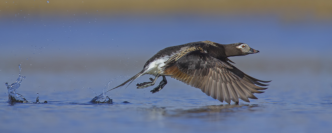
Having said this, we have made relatively few prints to date as our primary objective was to focus on improving our camera, composition and processing skills. We envision this continuing for some time. Moreover, of the roughly six thousand images currently exhibited in our Galleries, we feel there are less than forty that would qualify as "photographs" suitable for framing and hanging on a wall. As we've constantly stressed, taking good and well composed exposures takes time to learn and perfect. Nonetheless, in order to begin experimenting with color and various print media, we needed to create some sample images that were of sufficient quality to produce a creditable and worthwhile result. The image below is one that we subjected to an unbelievable amount of experimentation to develop a print process and finished product that we were happy with. This is not to imply it is compositionally correct or without flaw, simply that we have diligently tried to ensure the tonal gradations and color match the reproduction medium we have chosen and that the result is commensurate with our tastes.
After correcting our process shortfalls and experimenting with quite an array of paper types and sizes, we finally reached a point where we were happy with our finished product. In the end, we found 11X17 inches to be an ideal size for framing given the RAW file capacity we were working with. We also decided that traditional papers, specifically those with a glossy finish, were not to our liking as a framing medium. Although our Epson Stylus Photo R2400 printer is capable of working with quite an array of professional media, we found watercolor paper, specifically Epson 13X19 Super B Radiant White, to be quite easy to work with, producing a subtle, pleasing finish. In any event, we were looking to produce output that progressed beyond "old world" reproduction media. The textured, almost matte surface displays a vibrant, long lasting color that is more than suitable for framing. Again, this is an intensely personal decision. Our advice is to experiment and go with what works for you. Having said this, many photographers prefer a quality glossy look. Although there are an array of good finishes for InkJet printers, the professionals seem to prefer paper from Ilford. Profiles are available on their website. Lastly, there is a growing trend to reproduce images on canvas with very striking results. Again, most quality InkJet printers can handle this medium and profiled canvas suitable for printing is now readily available.
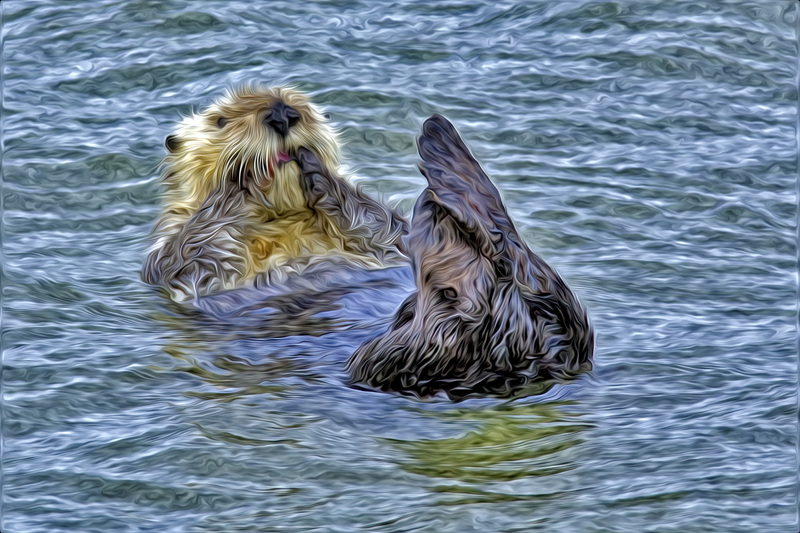
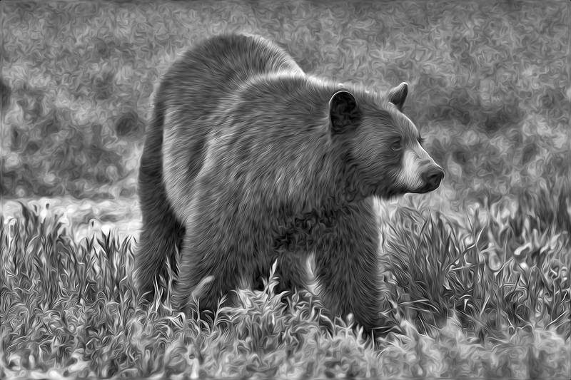
It also seemed to us that simply producing prints lacked an element of creativity. We were looking for something more vivid or surreal, allowing some interpretation to enter the equation. This undoubtedly resulted from the influence of our membership in the Canadian Association for Photographic Art (CAPA). We finally settled on watercolor renditions as exhibiting good potential for generating interesting results. We've been experimenting with LucisArt software, a PhotoShop plug-in. We feel it works best on images of single subject wildlife with a relatively homogeneous or blurred background. The following image is experimental and an early attempt that we will undoubtedly change as we gain more experience and develop a better sense of color. It is simply an example of the potential of this art form that you may find interesting.
Adobe introduced a free plug-in for CS4/5, Pixel Bender, that has an excellent Oil Paint filter. Although later versions of Photoshop do not support this plug-in, renditions of images using this program can be quite stunning, especially bird or wildlife portraits. We've found it particularly effective in salvaging images that we feel were marginal or throwaways. Again, it works best on single subject images with a homogeneous background, especially those where the hair or feather detail is well defined. We've found that centering the sliders and adjusting Colorization, Cleanliness, Stylization, Brush Scale and Brush Contrast (in that order) produce the best results. We generally adjust Brush Scale until the eye of the subject is sharp and the highlight well defined. However, the program seems to have trouble reproducing white so you may have to make some adjustments in Photoshop. Moreover, the best effects seem to be those that are run through the program two or three times. You can also simulate pen and ink line drawings by changing the final result to black and white. Like the above, the following images are experimental and we'll add or change the posted images as we gain more experience with the program. This is a program we have kept on an older version of Photoshop and one we continually return to as it produces fun images. Topaz Labs have since introduced Impression which also simulates oil, watercolor and sketch effects. One word of caution though, it seems to need a lot of computing power and may simply be too demanding on your system to function properly.
As you can see from the above, there are some hurdles and a few tricks to producing good prints. Our Workflow synopsis has covered the basics of color management and monitor calibration to ensure WYSIWYG. Page Setup allows you to control print orientation (Portrait or Landscape) and provides access to the Printer Properties (Paper Options and Advanced Settings). Once you've downloaded the appropriate printer profiles and made all these settings, it's important that you override the color management settings in your printer and let PhotoShop determine print color. You should always use the Print With Preview option to accomplish this. It is essential that you click on Advanced Settings and turn ICM on as this will override the printer color management commands. High Speed should be turned off. If you have downloaded the relevant manufacturer Printer Profile (an example is SPR2400 WC Paper - RW for the watercolor paper described above), then it is a simple matter of choosing the desired Rendering Intent. Your choices here are either Perceptual (preserves out-of-gamut colors as natural to the human eye) or Relative Colorimetric (shifts out-of-gamut colors to the closest reproducible colour). Much of the literature recommends the latter but your preference will be a function of your color taste so some experimentation is required before you gravitate to a consistent choice. We have had good results with both but lean towards Perceptual for most of our print output. Finally, ensure Black Point Compensation is checked.
Although we still follow this process using the same printer and processing software, we're sure that rapid technological change should by now have made it much easier to bypass many of the process complications that have plagued good home print production in the past. Certainly the technology has reached a point that home production is now a very cost effective proposition. We're also been told that sending files for external printing may be not only cheaper but also produce higher quality output. You may want to try White House Custom Color for what we hear are extremely good results. Beware though, external agencies usually use a LightJet technology that may require some image alterations to ensure a good result.